Devlog #24 - You Can Read It From Space
We often post work-in-progress shots of Snacko on our Twitter, and it was one fateful night of 1AM Twitter scrolling with my phone on night mode that I realized - “oh, it’s hard to read the dialogue text”. Not that you’d be playing the game on a phone in bed with the lowest brightness setting but, hey.
That, combined with our continued work on story cutscenes and quests that had us spending more time than ever with our dialogue and UI, caused me to take a step back and re-evaluate just how readable our UI was. Some of it was good. Some of it was, um, not good.
🔎 Very Lorge Text
The first issue was the textbox itself. It had a lot of padding around the text, resulting in a large percent of the screen being used for…nothing. Not only did this obscure a lot of the world, it also made the text small, as to make the whole dialogue UI take up less than 99% of the screen, we had to scale it down.
All the red area is unused! Well, there’s the name tag, but we still couldn’t do anything with the top half.
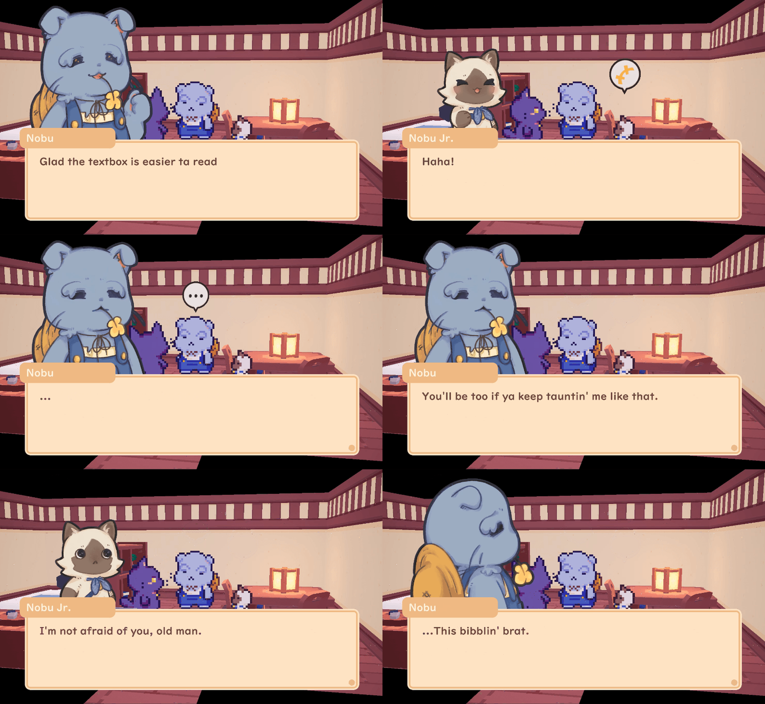
Ta-da! 🎉 Now, the textbox takes up less room on the screen, while holding larger text! The background color was also lightened to give the contrast a little boost, as the low contrast was making it difficult to read on screens with lower brightness.
📖 Learning Curve
Speaking of low contrast, one part of our story cutscene work is the player onboarding. To make the process easier on veteran farmers, we’ve left all the tutorials in tutorial pop-ups, instead of lengthy dialogue. That way, if tilling the soil to grow turnips is second nature to you, it won’t take up too much of your time. We had this already, but it looked a little, uh, rough.
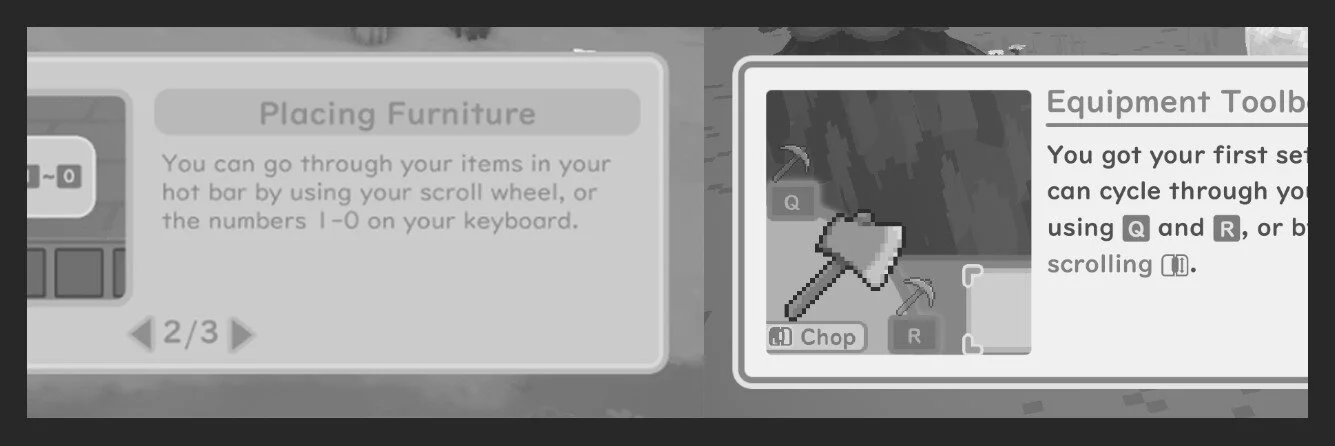
It had the same issue with the dialogue box - it was quite large but the part that was the most important - the text with the explanation - was very small. It also had an extremely low contrast, as you can see below with the white and black side-by-sides.
We also added a feature that minimizes certain tutorials to the bottom right while you’re working on a task! That way, if you accidentally spam your way through the tutorial pop-up, you can still double check which key brings up the menu and whatnot. How handy!
🎬 Cutscenes
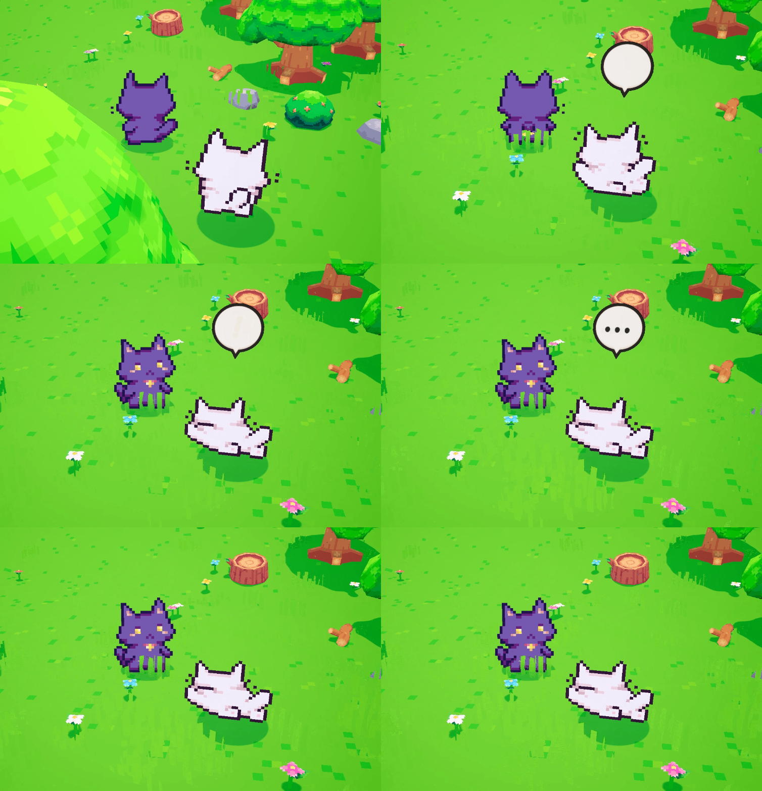
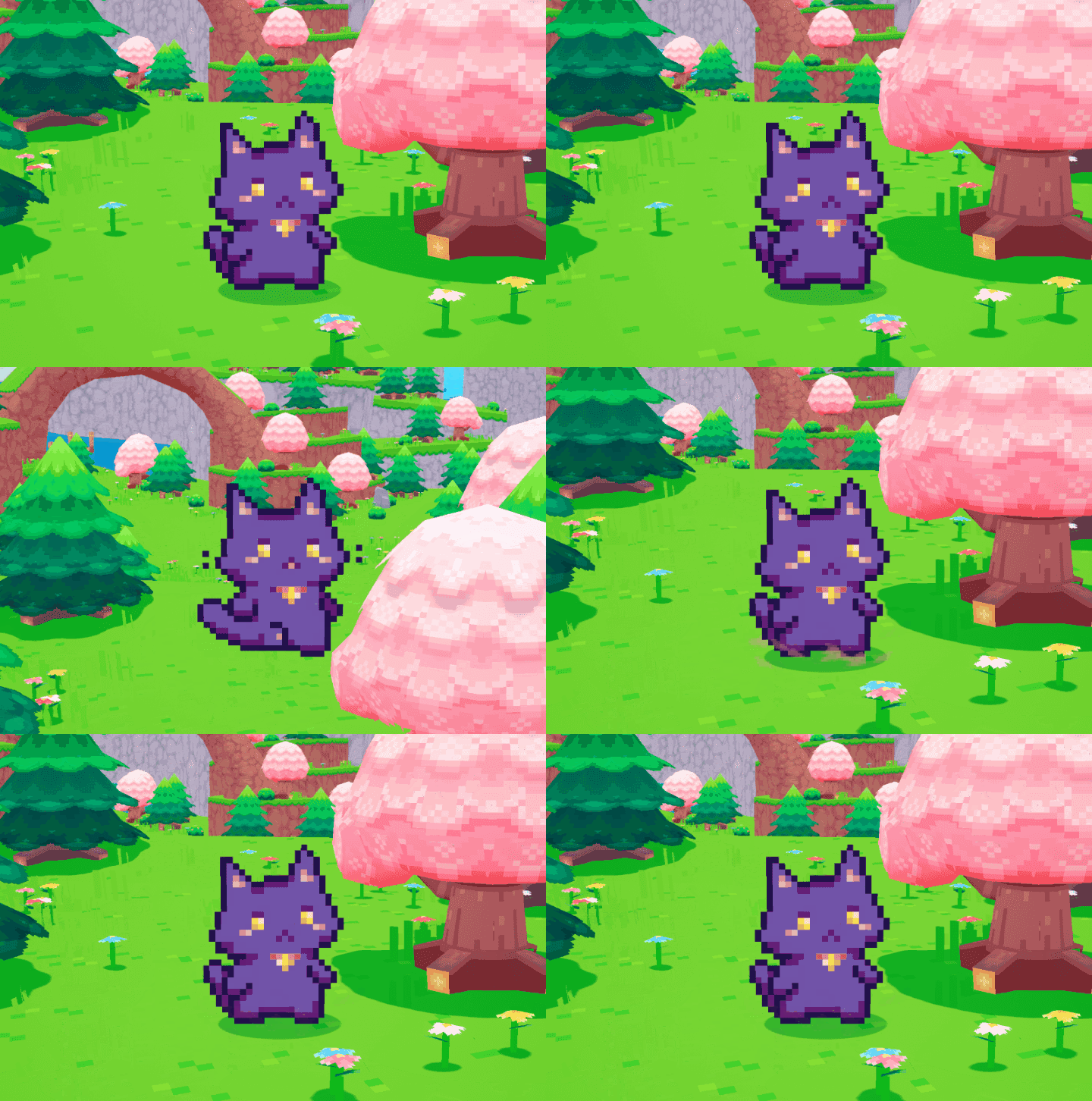
While working on cutscenes, we identified some features we needed that our cutscene system lacked. My personal favorite is the “follow player” function. It’s cute watching Mikan keeping up with you while you collect materials. We even have animation triggers for cute events like Mikan tripping!
Our cutscene system also works with our quest system to trigger certain cutscenes once you complete a quest task. In this instance, Nobu will continue his farming lecture once you’ve successfully planted and watered 9 turnips.
🌟 Some UI Sparkle
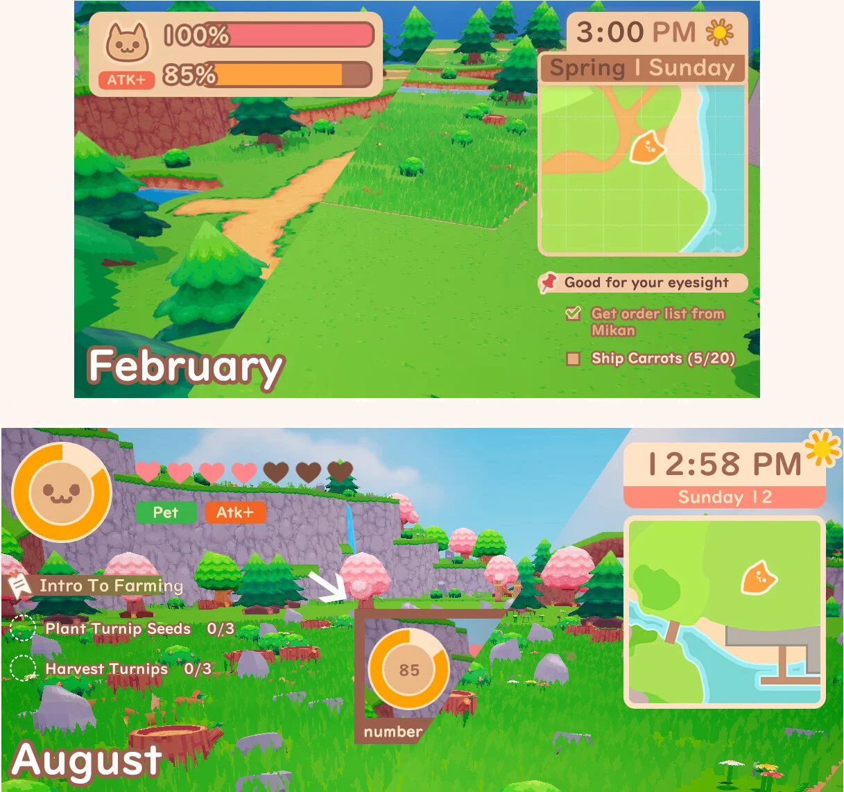
Do you spot some new UI in the above screenshot? The clock wasn’t working for us in other languages - most notably Japanese. To make it easier on us in the future when the game text is localized, we decided to simplify the clock UI down to give us the least amount of potential headache in the future. Now, it even comes with an auto night mode!
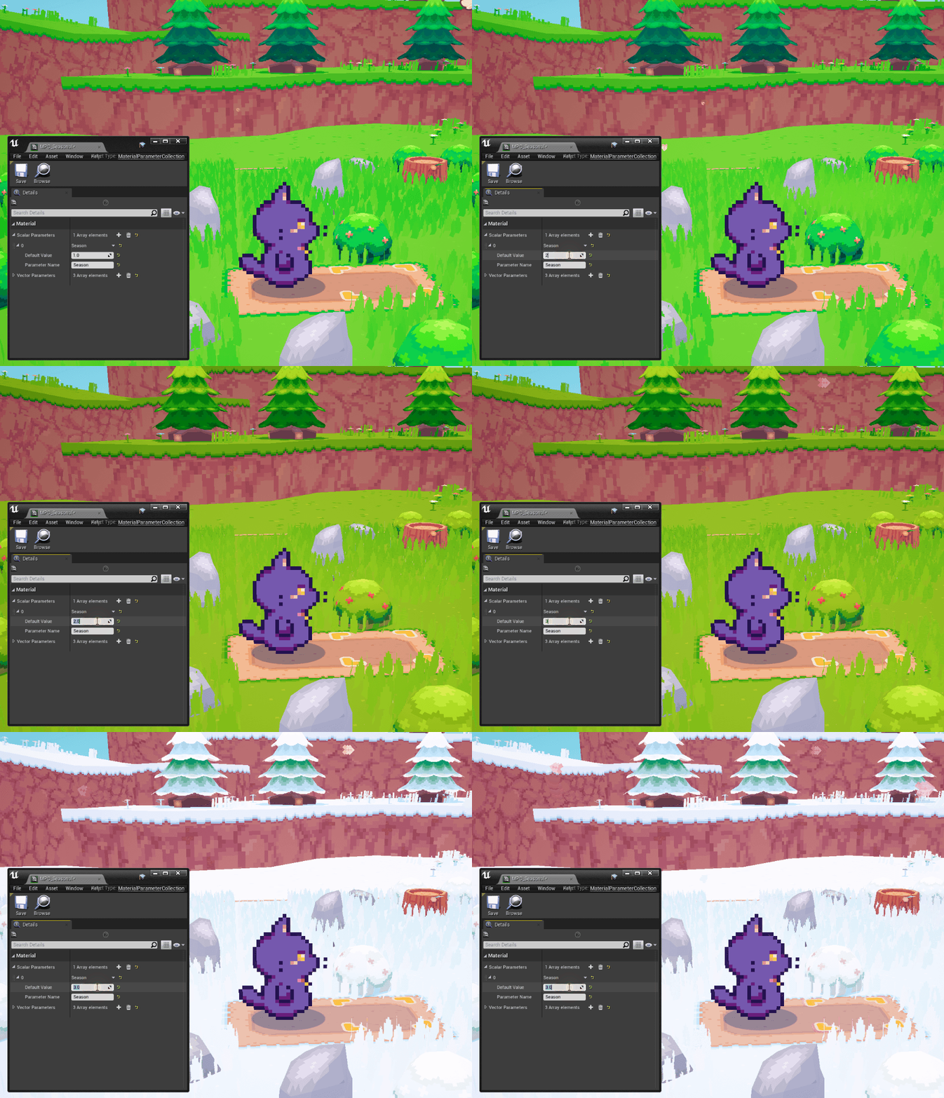
The season was something we figured was pretty easy to tell, and didn’t need to take up a giant portion of the clock UI. The color strip at the bottom will change colors depending on the season! No worries, the music and surroundings change, too.
PS: We got to listen to the seasonal tracks for the town and farm by Dale North! They’re absolutely ameowzing and we know you’re going to love farming to them! You can listen to a sneak peek of it below:
We’ve put off the UI implementation for so long we redesigned it before we finally got to put it in the game…👁👄👁 Here’s a comparison to how we were planning to have it look at the beginning of the year versus how it looks in-game now!
The stamina can be toggled to show a visual representation of your stamina level or a number for those who like to know exactly how many more tiles they can till. Regardless, both formats will have a circular bar displaying your remaining stamina.
And for the last bit of UI polish we have…embedded images! Useful for quests to identify by icon to see what items you’re looking for.
🥧 The Island Cultural Center
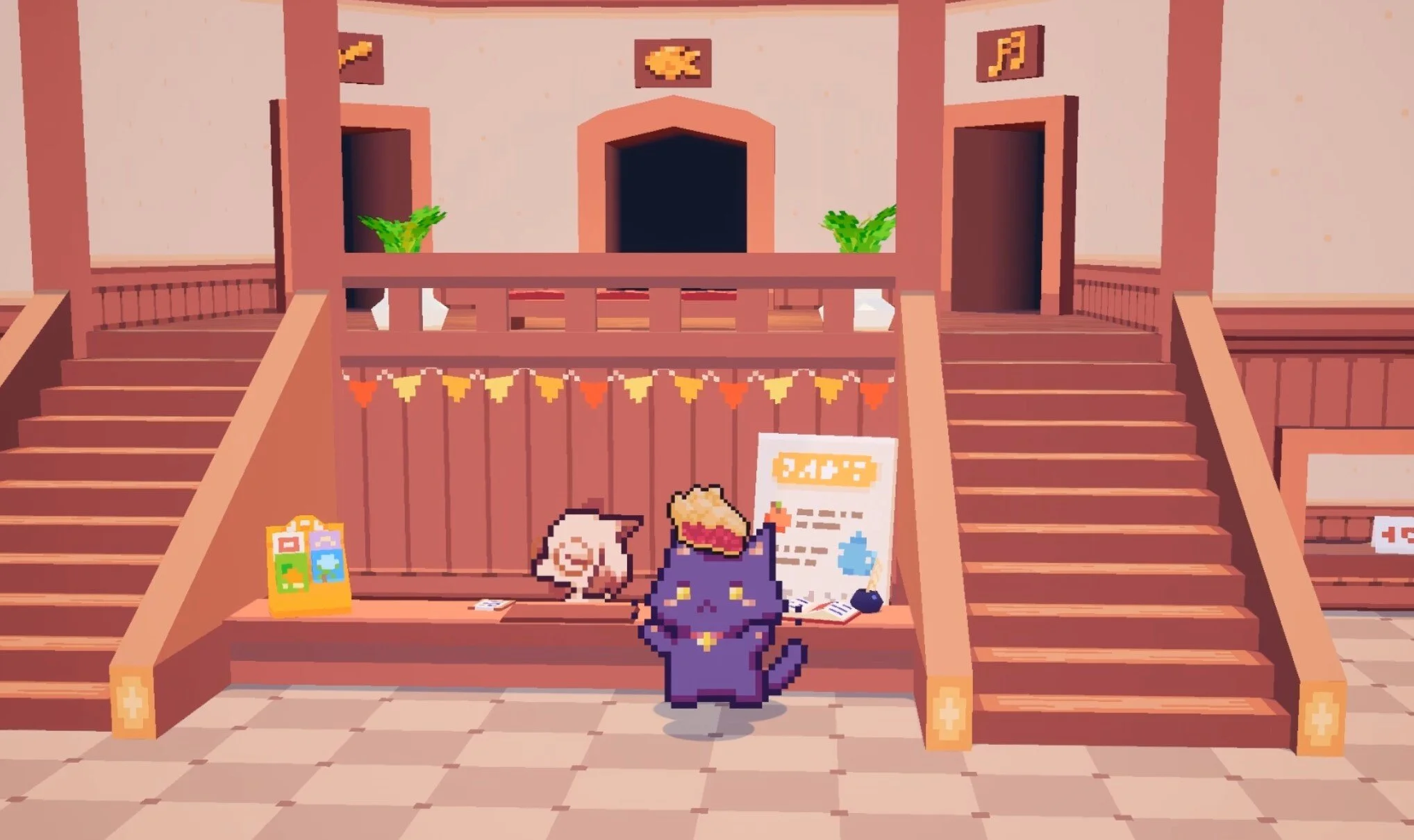
If you watched Wholesome Game’s latest video update - the Wholesome Snack - you’ll know that we have finally revealed our Island Cultural Center!
The Cultural Center is home to the Snacko Natural Artifacts Collection…or SNAC. At the SNAC, you’ll be able to donate all sorts of items you’ve crafted, found, and fished up in your adventures.
The three we showed off were the art gallery…
The furniture exhibit…
And the food exhibit! (My personal favorite, has nothing to do with my infinite love of eating.)
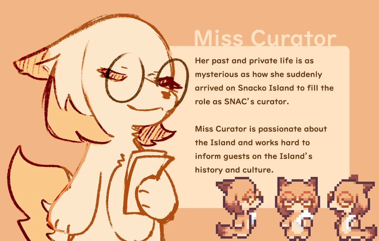
We also revealed Miss Curator, who will be taking care of the SNAC. The Cultural Center will be eventually home to other handy services, like the post office and other island administrative stuff.
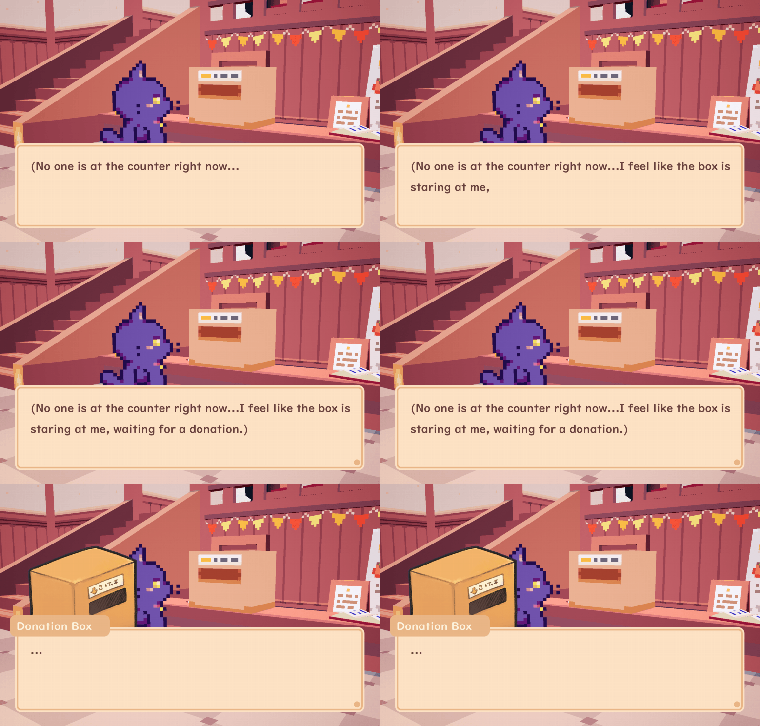
When Miss Curator is off work, expect to see the Donation Box pop up in her place to take your donations. Don’t worry, it doesn’t bite. I think?
🐯 Kickstarter Villagers
We’ve been working on Kickstarter rewards, too! Here’s a look at some early design iterations of backer villagers! In fact, we extended the pre-purchase period for the custom creator tiers, so if you’d like a tourist, they’re still a few left up for grabs at our shop.
🌎 Welcome New Team Members!
We’re also excited to introduce everyone to Adam Cohen and Joseph Jobst! Adam will be helping us with the four biome’s level design! Joe will be working his magic creating special visual effects for the game.
The matching pixel VFX will be a great touch to the pixel world
Phew, we’re finally at the end here. That’s all for the month of August! Thanks for reading, and we’ll see you next month 🐾
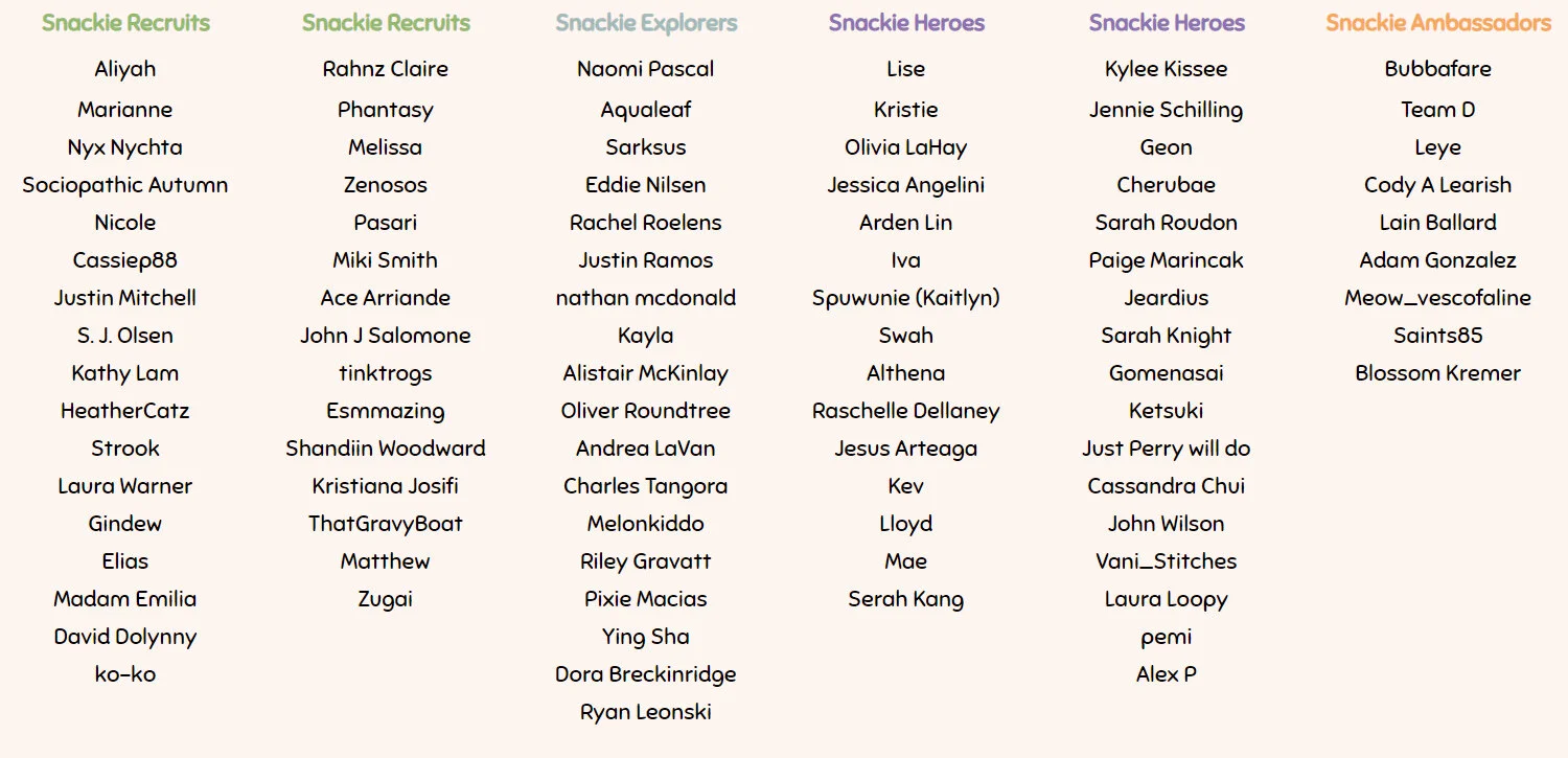
Extra paws and love to our lovely patrons 💕


