Devlog #1 | Humble Beginnings
Yay! This month was the “official” first month of development on our super (not-so-secret) cat adventure game! When we started this project, we knew we wanted to encapsulate the feeling of earlier Zelda games such as Minish Cap or Link to the Past, with the aesthetics of brighter RPGs like Mother or Pokemon! The first few weeks of the month were spent on some basic visual development discussions that aren’t very exciting. “What do we want it to look like?” “What will the camera be like?” “What kind of colors should we use?” It took up a lot of time, and even now the camera is still a work in progress. Inspired by the marriage of 3D and pixel elements in the new Octopath on the Switch, we decided to slap some pixel art textures on a model and see how it goes.
Blocking Things In
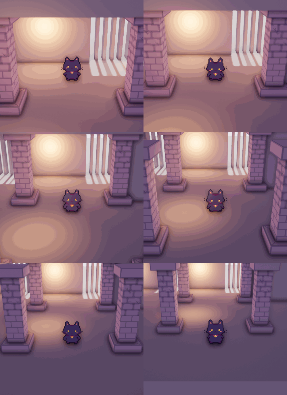
This was one of our earlier prototypes…just a sprite of Momo walking…in one direction. I tried different lighting scenarios and ways to get the indirect lighting I wanted without sacrificing the dynamic lighting for shadows and lighting up the sprite. A good 3 weeks later, we land here:
Baked directional lighting, then switched to dynamic to help cast shadows on the sprites. This way we get softer shadows without sacrificing the cool effects of dynamic lighting.
Little Items
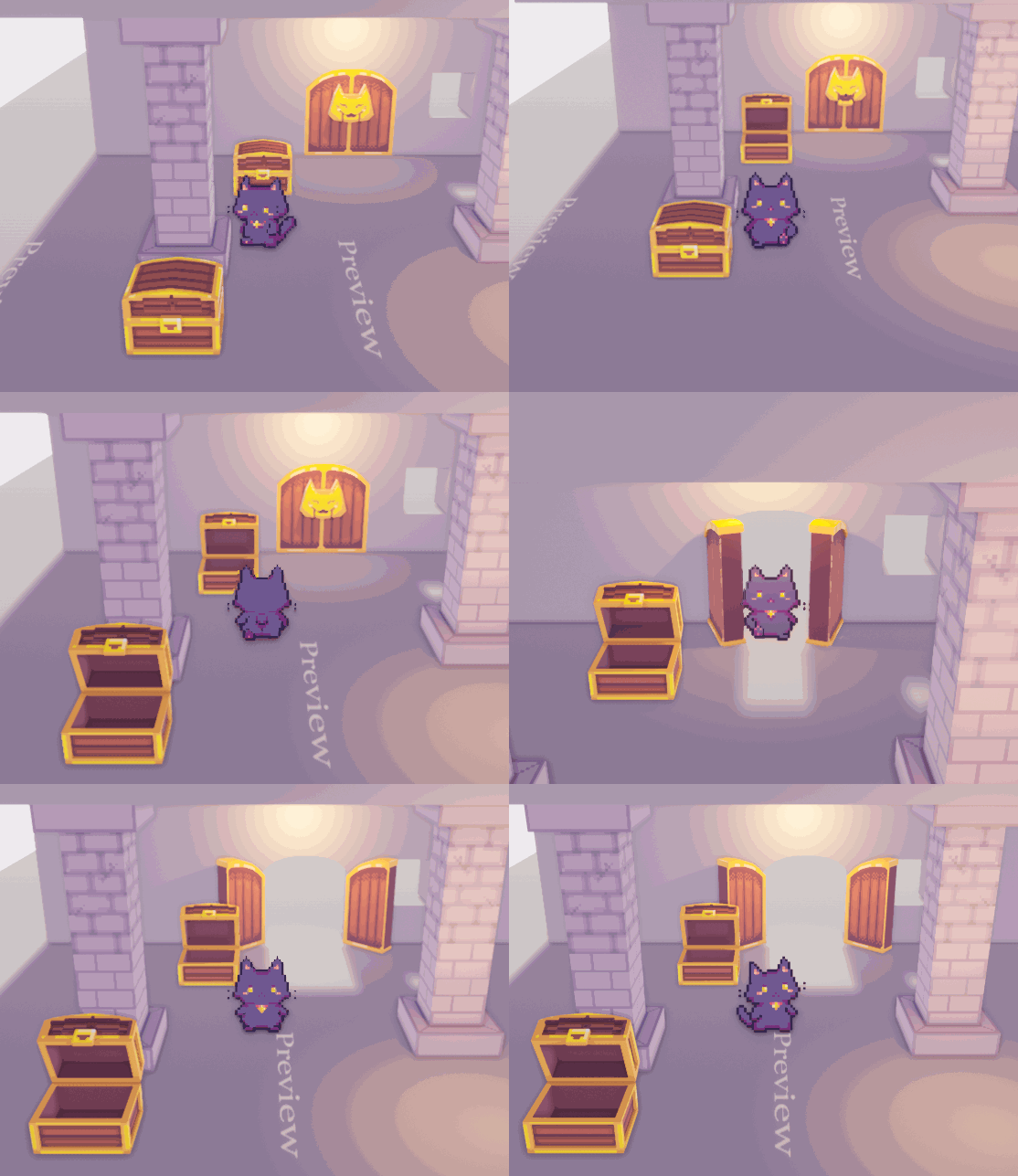
Other features implemented on the code side, which I have absolutely 0 involvement in this time around, include chests, keys, NPCs, enemies, damage, knock-back, and a bow and arrow!
The way recursive set it up made it easy for me to change parameters – everything is written in C++, but certain parts where information would be changed from asset to asset has been exposed in Blueprint. This way, I can change things such as sprite sheets and damage numbers without bugging him every other minute. There’s also some fancy code stuff going on where things are of the same class, or type, so it’s easier to handle interaction in the long run. How it actually works, I have no clue.
Lastly, since we finished some basic elements, I started concept art for a first dungeon to polish camera, aesthetics, and combat! I stream these sessions on my Twitch channel, and viewers have given great suggestions. One of them was a subway with a more cave-like structure, with vintage ads plastered over the deteriorating walls.
I thought it’d be cool to include a map element like a vague subway map to aid your adventure, and use old neko subway cars as resting points or shops along the way. Next month, we’ll be focusing on solidifying puzzles, dungeon aesthetics, and polishing the UI!


