Devlog #12 | User Interfaces
A few weeks ago, we asked people on Twitter if they'd like to have the monthly devlogs delivered straight to their inbox via our mailing list, and the results were "yes"! From this month forward, devlogs will be posted here on the blog and sent out as an e-mail. We finally settled in this month, and recursive has also started Snacko as his full-time job! Please look forward to all the fun updates coming up!
New Town...Again (3)
How many times have we reworked the town map? Too many times to count. It's an important space, though, so we want to keep iterating it until it feels right. Since our building update that allowed players to place objects on or off a grid and rotate however they'd like, we were able to make the overall design of maps more organic. In addition to that, we split the town into more recognizable sections - players will be able to unlock new places as they progress through the game.
Currently, there's the area leading to your farm, the town square, and the bridge leading to the wilderness. The town square is characterized by the paved, straight roads, and an area for villagers to gather and post their requests and thoughts on the notice board. To the west of the town is the path to the wilderness - right before you get to the bridge, there's the junkyard. Items will randomly spawn here every morning as the villagers throw away their unwanted things...sometimes, you might get lucky and pick up something useful!
Interfaces and Systems
This month has been a lot of work on improving existing systems and adding new features on top of existing systems. The new inventory UI has been implemented, and with it, the ability to stack and split items.
The crafting menu is usable again! Not only does it look different, it's also easier to see what you're missing and what you have enough of. Items are also now sorted by categories and sub-categories, making it easier to find the item you want to craft!
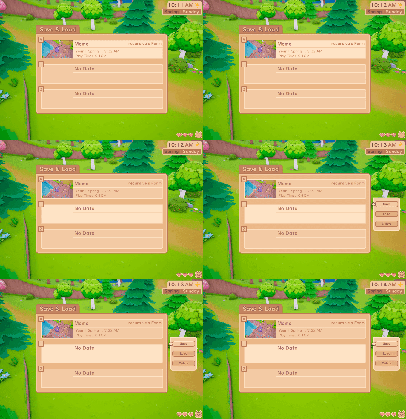
You were always able to save and load in Snacko, but it was bound to a hotkey with no user interface whatsoever. Not only did we add some fancy UI to show you your save slots, there's also now an auto-save slot with two manual save slots, and thumbnails for each to help jog your memory! We still need to add in a nicer transition to smooth in loading a game, but it works!
You may have noticed there's proper icons now instead of scribbles. We're slowly working on replacing all placeholder art with more polished versions!
A cool new feature we added this week was the option to turn on and off the HUD, as well as the depth of field effect (where super close and far away things are blurred). Every player has different preferences, and some may want to turn on the fancy stuff just to take screenshots. We get that, so we made it super easy to toggle these options. In the future, we'd also like to have options for players to choose where they'd like their health indicator and clock to be.
Changing the Landscape
When we first started reworking the maps from being very cube-like and geometric to a more organic feel, the paths and so on were vertex painted. All that meant was that the different textures representing grass, dirt, and other materials were applied to and saved to each and every point of the ground.
I've changed out the old farm with the new farm terrain - not only is a lot more optimized, the paths also look a lot smoother since it's done through Photoshop as a texture, and not reliant on how many polygons there are.
That's all for the month of August! We're super excited to see how much more progress we can make now that we're both full-time working on Snacko. As always, thank you to our lovely and generous patrons that make all this possible! If you're excited for Snacko, please consider pledging so we can continue focusing on development!
See you next month!


