Devlog #59: Let Us Cook
Hello everyone! It’s August. Is that the middle of summer or the end of summer? Anyways…
This month, we have a mixture of bug fixes along with polish and implementation, so it’ll be a more interesting devlog than just “haha bugs”.
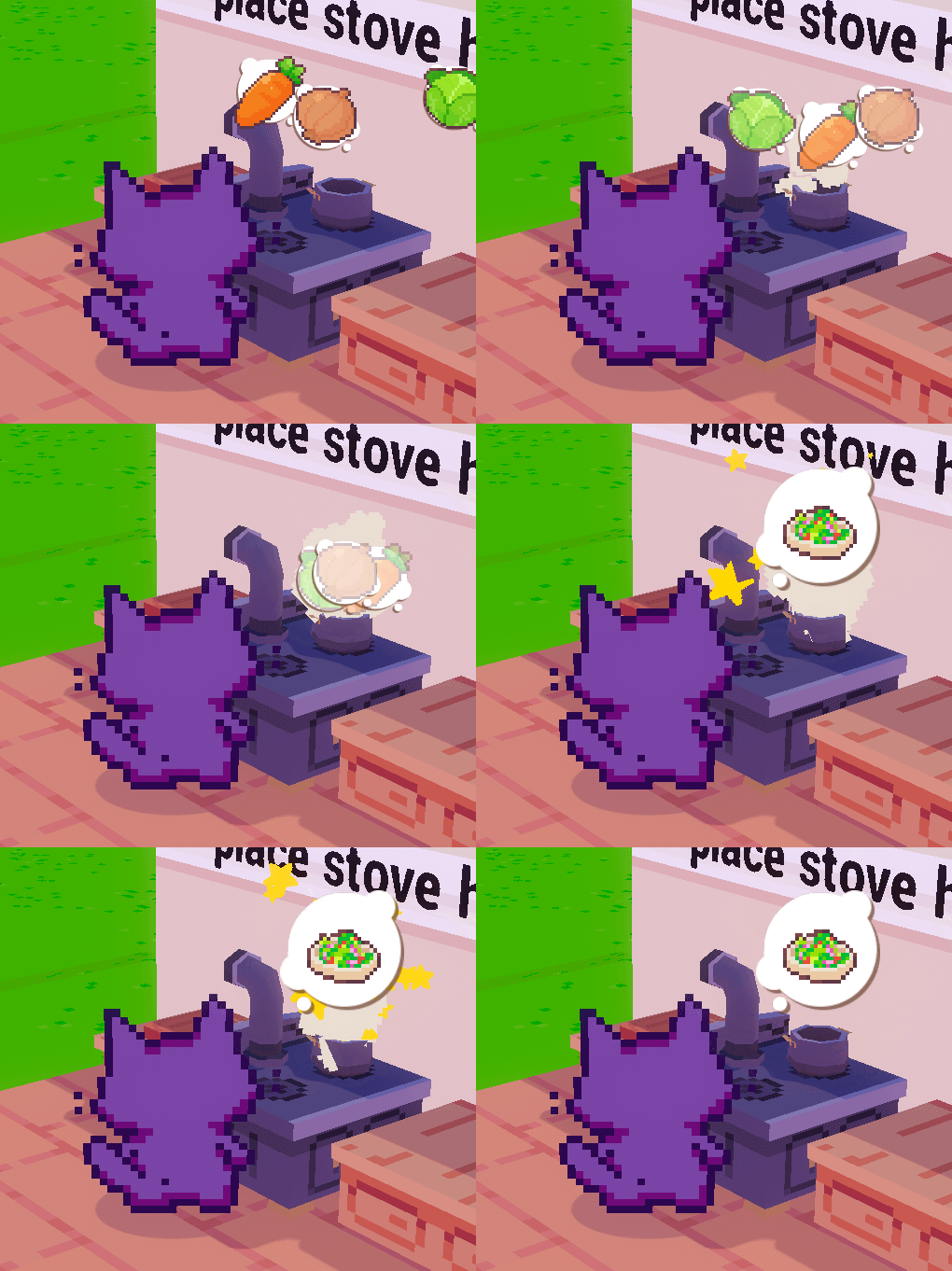
🍳 Let Us Cook
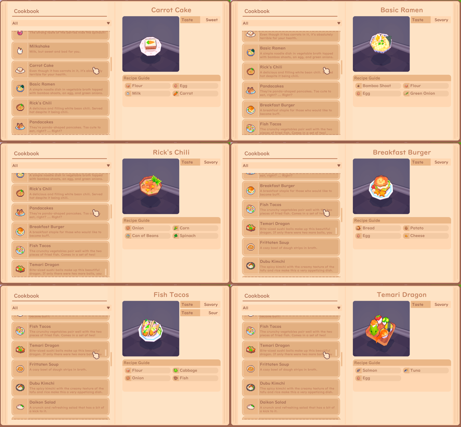
Cookbook now has a preview of the dish! It’s just a nice touch, I think. The cookbook is one of those UI screens that we made way back when cooking was a point and click experience - you pick a recipe, then you cook it.
Then later on, as the game matured a bit, we swapped it to dropping ingredients in a pot. So the cookbook UI didn’t match what it should’ve been: a reference point.
Now it correctly shows the dish’s taste attributes (handy if you’re going to work part-time at a restaurant!), recipe, icon, description, and 3D model.
Enjoy how the real-time preview is set up in the engine. ✨dramatic lighting✨
🎮 Which Button?
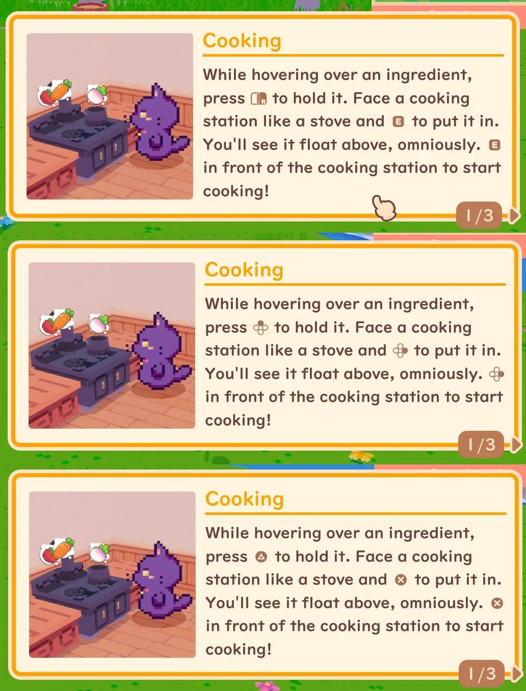
Sure, we made the assets for the different keys and mouse buttons, but unless you were playing a console build, there was no way of accurately determining which button set up your plugged-in gamepad was using on the computer.
Paige worked hard to set up all the framework for making it possible, and Zoro brought it to the finish line implementing the dynamic system in existing UI.
Now you can press A, or right face button, or X…whatever makes you happy.
🖼️ Set Dressing
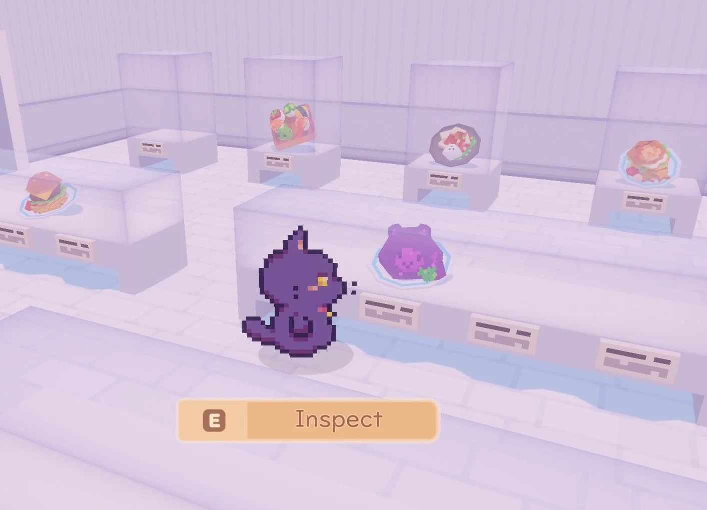
Another aspect we’ve been working on is having the items you donate to the Cultural Center actually show up.
What a concept, eh? Furniture items are in set rooms.
Items not yet donated will appear as a shadow. As you populate them, I hope you feel satisfaction watching them fill up!
Food items also show up in their display cases.
📬 Others
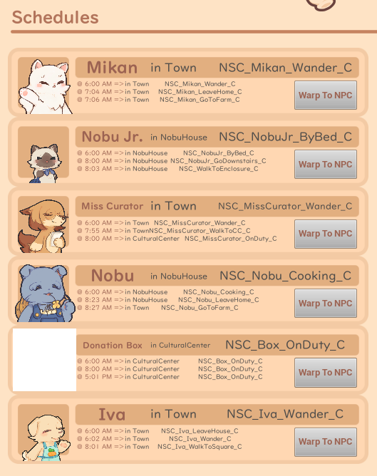
We also did a bunch of odds and ends. NPC schedule testing was difficult in the past, but not anymore! recursive made a debug tool that shows each NPC’s next action, along with the option to teleport to where they are.
It’ll be easier to troubleshoot what’s going wrong when someone is spawning off in the depths of hell.
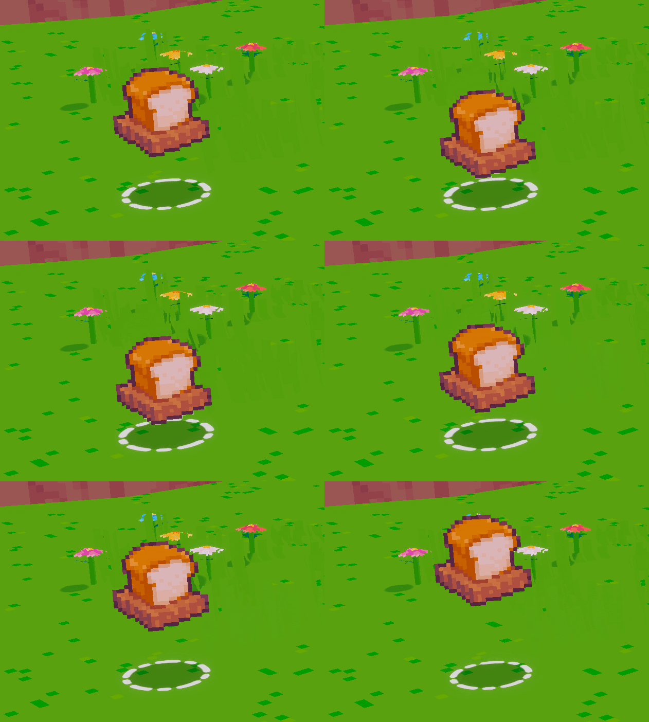
The round circle shadow on the ground of dropped items was not graphical enough so it felt a bit uncanny. We fixed this up by giving it a bit of a look overhaul.
Dye icons were something that were never color matched. In fact, I also didn’t update our internal visual guide on which colors are which name. So we took some time this month to clean that database up. Finally, Blush Pink is no longer bright green.
…And that’s all for what we’ve been up to in July! Enjoy the rest of your summer! Or winter…
Extra thank you to our Patrons and Ko-fi supporters! Without you, Snacko development would look very different. We appreciate every one of you 🐾

