Devlog #5 | Birth of a New Town
Ah, the sequel of Birth of the Town released in July 2018. After our overhaul, I couldn’t use 99% of the assets I’ve already made. So, I had a good cry, and shelved them away. But, TA-DA! It has risen from the flames.
New Town Map
What’s that? It looks empty and sad? …You’re right. All the houses in there are duplicated, since I only have 3 distinct houses right now: the player house, Mikan’s house, and the first NPC’s house. The idea of the town is that it’s abandoned with only a few cats left behind, and your task as the player is to go out there and convince everyone to come back and reform the community. We wanted to give players the ability to make their town really theirs. This brought up some issues: (A) it’s not exactly a pretty screenshot (B) the layout must allow flexibility, and (C) it would still need structure to it. I went through many iterations of the town layout.
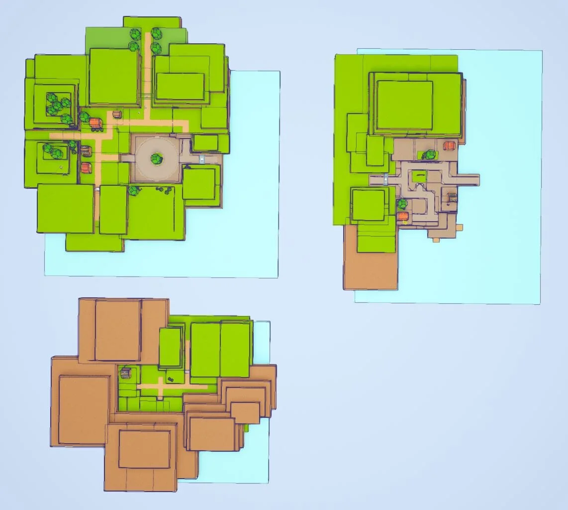
This is the third layout I tried – it was just one giant area. When we walked around, it felt too big, but also too small. It was easy to get lost, and there were no real landmarks…just lots and lots of grass. So, I split them up! Now there’s the plains, the port, and the mountains area. The entrances and rough placement of each area is still the same, but now they’re in their own contained little space.
Collecting Reference
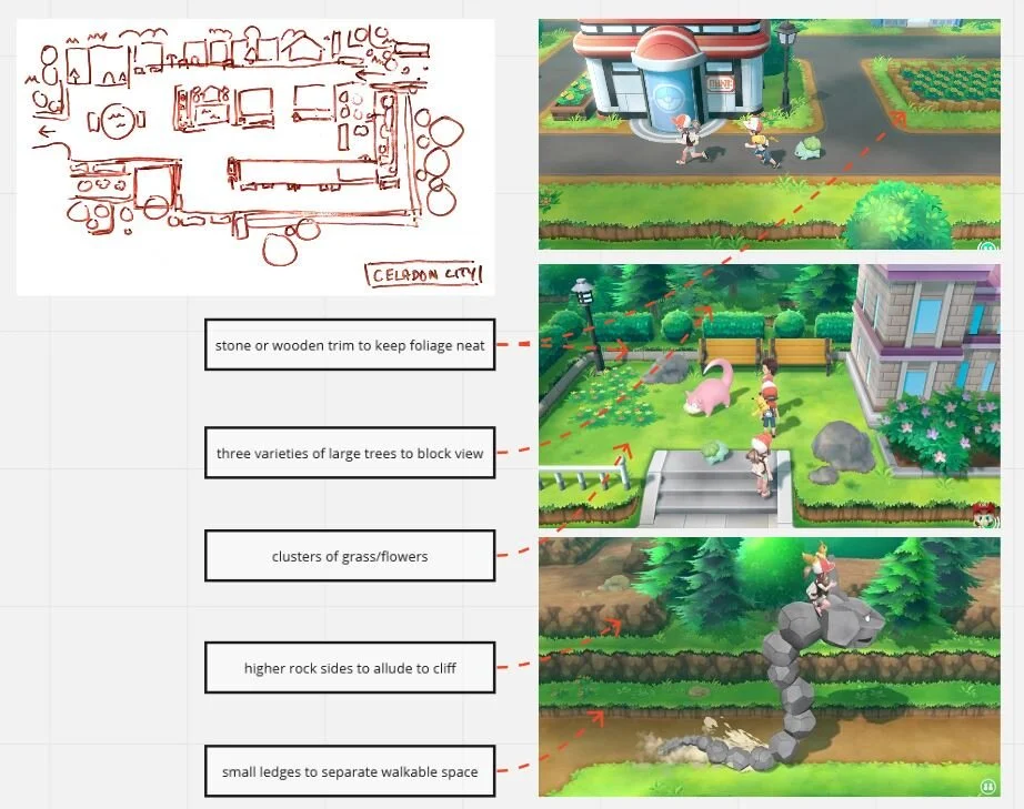
The whole of it is made from about 4 cubes with different trims on the sides and a world-aligned texture on the top. I took a lot of references from Pokemon Let’s Go on how they cut off player’s view in a 3D camera setting. Tiered landscapes, and lots of foliage is the way to go.
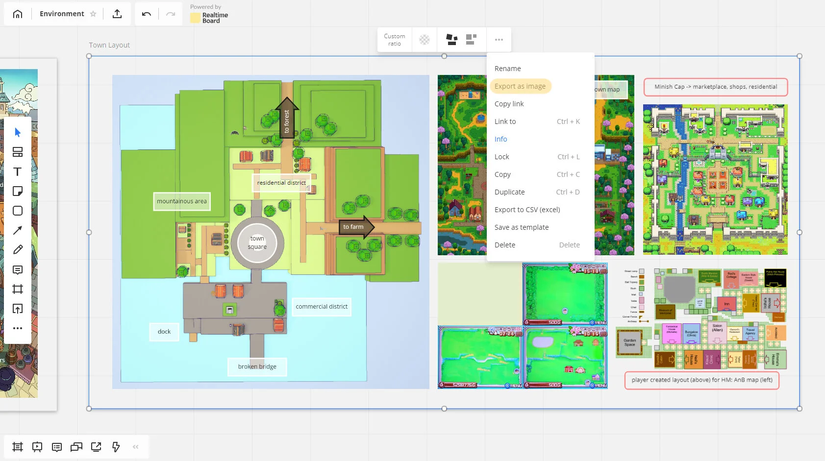
Below is part of my RealtimeBoard section for creating the town layout. It helps me organize my Pinterest pins and also add notes in one convenient place. I do this with every environment I need to do: collect reference, make notes on what makes them attractive to decide what kind of pieces I need to make, and start making them with this on my second monitor to keep consistency. I’m still working on the town area; it’s missing things like garden trims, grass clusters, flowers, and different shaped rocks.
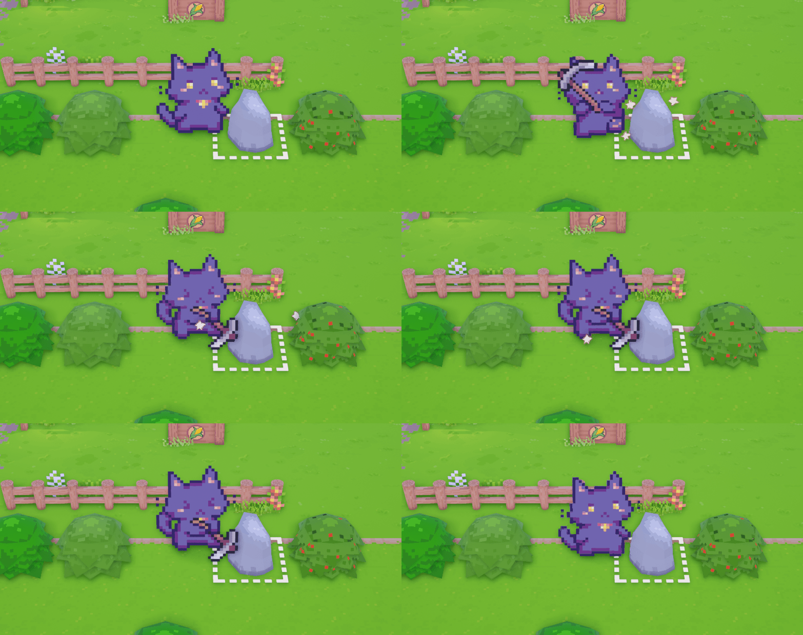
While I’m working on that, recursive has been polishing up some aspects of the farm, like adding sound effects and visual effects to certain actions. They’re still kind of placeholder, and we’re still exploring styles for VFX in the future.
UI Reborn!
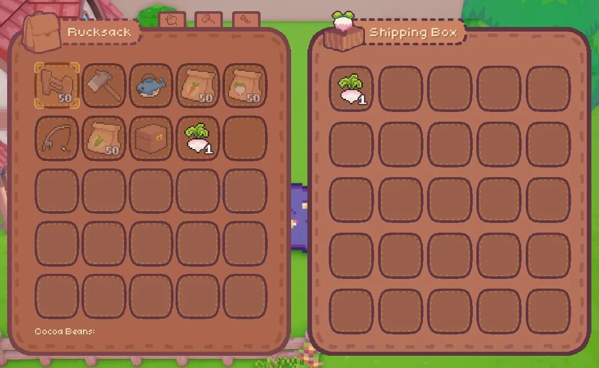
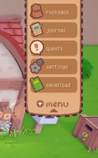
Asides from polishing the field, I’ve also reworked all of the UI! The old UI was a little bland and hard to see. After a solid day of doing nothing but looking at game UI until my eyes bled, I did a quick mock-up in Photoshop to get a feel for it before I made the components in Aseprite.
The finished UI in-game looks very similar to what I did in Photoshop, but I tweaked the colours to fit the palette we’re currently using. There’s still certain things that ended up looking not-so-great in pixel form, like the “EXIT” button and the cursor. Overall, it hit the notes I was looking for and it’s much more readable in-game now.
There were also a ton of other assets made, like a mod kit for starter town houses, new shipping and storage containers, and NPC sprites. But, the really cool thing is our work in progress dialogue system!
Let’s Chat…
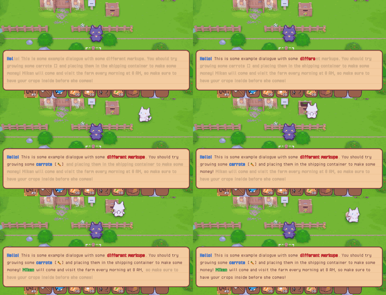
One of the issues recursive came across early was how UE4 handled word wrapping. For a split second when it’s typing out the letters individually, it would go out of the boundary for a split second before being correctly aligned. To get around this, he ended up having to render the whole text box right off the bat, and then changing the colour of each letter to fake the look of them “appearing”. Here’s a GIF showing how it works, but with faded text instead of fully transparent text:
The colours, portraits, and choice buttons are placeholders, but it works!
Mikan comes along your farm every morning to collect what’s in your shipping box. Depending on how much you’ve shipped, or if you’ve shipped any at all, her dialogue changes to reflect that. One of the biggest points in a farming sim for me has always been characters and their dialogue – we’re really hoping to have a nice variety of daily dialogue for NPCs to say to keep it fresh!
This has been the non-boring stuff we’ve worked on in January! With two more months until GDC, we’re really pressing the gas pedal hard now. Look forward to stickers being released soon! We’ll be giving them out at GDC, as well as mailing them to $10+ Patrons!
Thank you to our Patrons this month who helped make the stickers possible! The support really helps – I get all happy when I think about it!
Anthony Meyler
Martin Klocker
Ryan Leonski
alxs
Jammo
Zugai


